
Urgency is supposed to be the villain of the UX story. Countdown timers, “only two left,” “prices go up at midnight.” Every fintech onboarding review I have sat in treats urgency as something to be interrogated, softened, or removed. Then this week, actual mortgage brokers started telling actual clients to lock in a rate before Friday, and the advice was correct. That should bother every designer who has ever flagged urgency as a smell.
No interface was involved here. No app, no screen, no button. But the mechanic underneath a broker’s phone call and a UX urgency pattern is the same one: a claim about scarcity or risk that the person receiving it cannot independently verify in the moment. That is the mechanic worth examining, wherever it shows up.
The problem, as reported
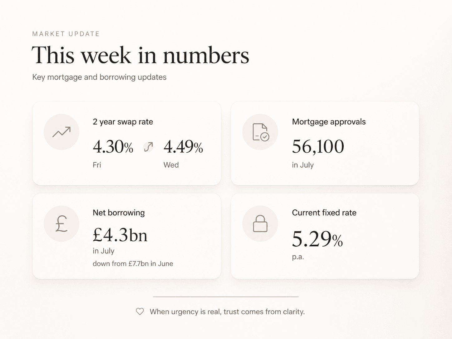
UK fixed rate mortgage pricing moved sharply this week, and brokers moved with it. The Financial Times reported that two year swap rates, the benchmark lenders use to price fixed deals, jumped from around 4.3 per cent on Friday to a high of 4.49 per cent by Wednesday morning, while five year swaps briefly touched a three year high. Aaron Strutt of Trinity Financial described the swap movement as grim reading and said brokers were expecting fixed rates to rise even without the big lenders having moved yet. Adrian Anderson of Anderson Harris said he and his colleagues were actively contacting clients who were due to remortgage soon, asking them to bring the decision forward. Gen H, an online only lender, confirmed it would raise all its rates from Thursday evening.
The trigger sits outside the mortgage market entirely. Renewed hostilities between Iran and the US reignited inflation fears, which pushed the UK ten year gilt yield to its highest level since 2008, and swap rates followed within days. Moneyfacts data confirmed swap rates hit thirty day highs this week, with finance expert Rachel Springall warning borrowers to secure a new deal quickly before lenders start repricing. Lucian Cook of Savills added useful context here. He noted that since the outbreak of the Ukraine war in 2022, mortgage markets have become increasingly sensitive to any shift in the geopolitical picture and its effect on inflation and base rates. This is not a one off spike. It is a market that now flinches at headlines by default.
Meanwhile, mortgage approvals had already fallen to 56,100 in July, down 15 per cent year on year and 13 per cent below the ten year average, meaning buyers were reluctant to commit even before this latest jolt. Net mortgage borrowing dropped to 4.3 billion pounds from 7.7 billion in June. The HomeOwners Alliance confirmed the same pattern from the demand side, noting that swap rates rose sharply once markets started pricing in rate rises instead of the cuts they had expected before the conflict escalated.

The design lens
Strip away the mortgage jargon and what you are left with is a trust interface under real time pressure. A broker has to tell a client something is changing, that waiting has a cost, and that acting now protects them. That is the exact shape of every urgency pattern a fintech product ever ships. The difference is that nobody built a countdown timer here. Strutt did not manufacture the swap rate spike to hit a conversion target. He read it off a screen and picked up the phone.
This is where “design without strategy is just art” earns its keep. A fintech team that treats urgency as inherently suspect, and strips it out wholesale to look ethical, is optimising for the appearance of restraint rather than the client’s actual interest. A fixed rate mortgage decision genuinely does get worse if you wait a week in a week like this one. Removing the sense of urgency from that interface would not make it more honest. It would make it less useful, and arguably more negligent. The strategic question was never whether to use urgency. It was whether the underlying claim was true, and whether the person could check it.
The UX principles actually at play
Urgency and scarcity as persuasion levers were named and studied long before software existed. Robert Cialdini’s work on scarcity, laid out in Influence, established that people assign more value to things they believe are limited or time bound, and that this bias fires whether or not the scarcity is real. That is the mechanism brokers were leaning on this week, deliberately, and honestly.
Harry Brignull, who coined the term dark pattern in 2010 and runs deceptive.design, built his entire taxonomy around one distinction. A dark pattern is a trick that gets someone to do something they would not have done if they had understood it or had a real choice. Fake urgency, invented deadlines, countdown timers that reset when you refresh the page, all of it collapses under one test: does the claim survive being stated plainly. “Rates may rise because gilt yields hit a seventeen year high” survives that test. “Only two rooms left at this price” usually does not.
Cognitive load matters here too. John Sweller’s cognitive load theory holds that working memory can only process a small number of new elements before comprehension breaks down. A client facing a remortgage decision is already juggling affordability, term length, and fees. Layering in genuine urgency without also reducing everything else the interface asks of them is how you get panic decisions instead of good ones. The brokers quoted this week did the harder thing. Anderson’s team called clients directly and asked them to send documentation early. That is urgency paired with a reduction in friction, not urgency paired with a ticking clock.

How I would design it
The problem is not that fintech products use urgency. The problem is that most fintech products cannot tell the difference between real and manufactured urgency once it is time to ship, because nobody built a way to check.
The constraint is that urgency claims usually originate from a data feed the user cannot see, a swap rate, a stock level, a fare curve, and the interface has to compress that into three seconds of attention.
My decision would be to make the source checkable, not just the claim visible. A rate lock prompt should link straight to the number driving it, in this case the swap rate movement, updated live, so the client can verify the claim themselves rather than trust the copy. I would also cap urgency messaging to once per decision point rather than persistent banners, because repetition is where a true claim starts to feel like manufactured pressure even when it isn’t. And I would kill any deadline that resets. If the swap rate genuinely settles back down, the interface should say so immediately, not quietly extend the countdown. A design that only ever escalates urgency and never retracts it is not tracking reality, it is tracking conversion.
The close
Every dark pattern taxonomy exists to protect people from claims that cannot survive daylight. This week’s mortgage story is a rare case where the claim held up completely, and the brokers using urgency were doing their job properly. The next time a review flags urgency copy as a red flag on principle, the real question is not whether urgency is present. It is whether the thing driving it would still convince you if you could see it for yourself.
Sources
Follow me to keep in touch
Where I share my creative journey, design experiments, and industry thoughts.


