
Ever tried to vote on a live TV show and watched the app fall apart at the exact moment you wanted to take part? That was the opening night of I am a Celebrity 2025. A national voting moment turned into a digital faceplant. And that meltdown revealed more about product design than anything crawling around the jungle.
The chaos started fast. The series launched on 16 November 2025. Viewers downloaded the official app ready to choose who faced the first Bushtucker Trial. Except the app chose violence instead. It froze. It stalled. Codes went missing. People were thrown out of the login screen like the system was actively rejecting them.
The Independent broke down the mess here view here
It set the tone for what should have been an easy win. A single tap. A simple vote. A shared national moment. Instead it became a lesson in how fragile trust can be when a product fails at the exact moment it needs to shine.

The App Makes the Show or Breaks It
This is not just a TV show. It is a product ecosystem. The broadcast. The app. Social media. The audience. Everything feeds everything.
You plug in. You vote. You expect your vote to matter.
When the main channel for interaction fails the whole experience falls apart. Not a small glitch. A full product failure. A service failure. And a loyalty failure.
Some useful context
• The app is the only way to take part in trial voting
• Traffic spikes are huge and predictable
• Viewers reported feeling locked out which instantly makes the result feel suspicious
One Reddit user put it bluntly, “It took me about 30 goes but got there in the end” https://www.reddit.com/r/ImACelebTV/comments/1oztkjb/anyone_else_unable_to_vote_on_the_app
If you design interactive products you already know this. Live voting is mission critical. You treat it like infrastructure. Not decoration.
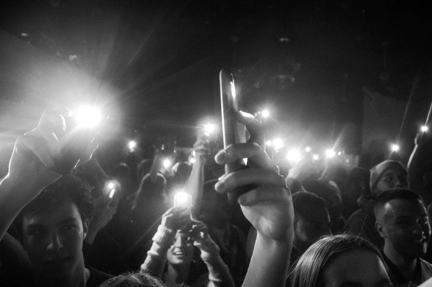
The Emotional Toll Nobody Talks About
People love to say “It is only a TV show” but that misses the point completely.
For a lot of viewers this is a ritual. A comfort moment after a long day. A shared thing with family. You vote together. You laugh when your choice gets picked. That tiny moment of control is part of the magic.
Take away the ability to vote and the whole emotional loop collapses.
People felt
• Frustrated because the app refused to cooperate
• Suspicious because the vote still went ahead
• Disconnected because the excitement was taken out of their hands
Design does not stop at colours and buttons. It shapes the emotional contract. Break that contract and everything else feels off.

The Service Design Problem Nobody Sees
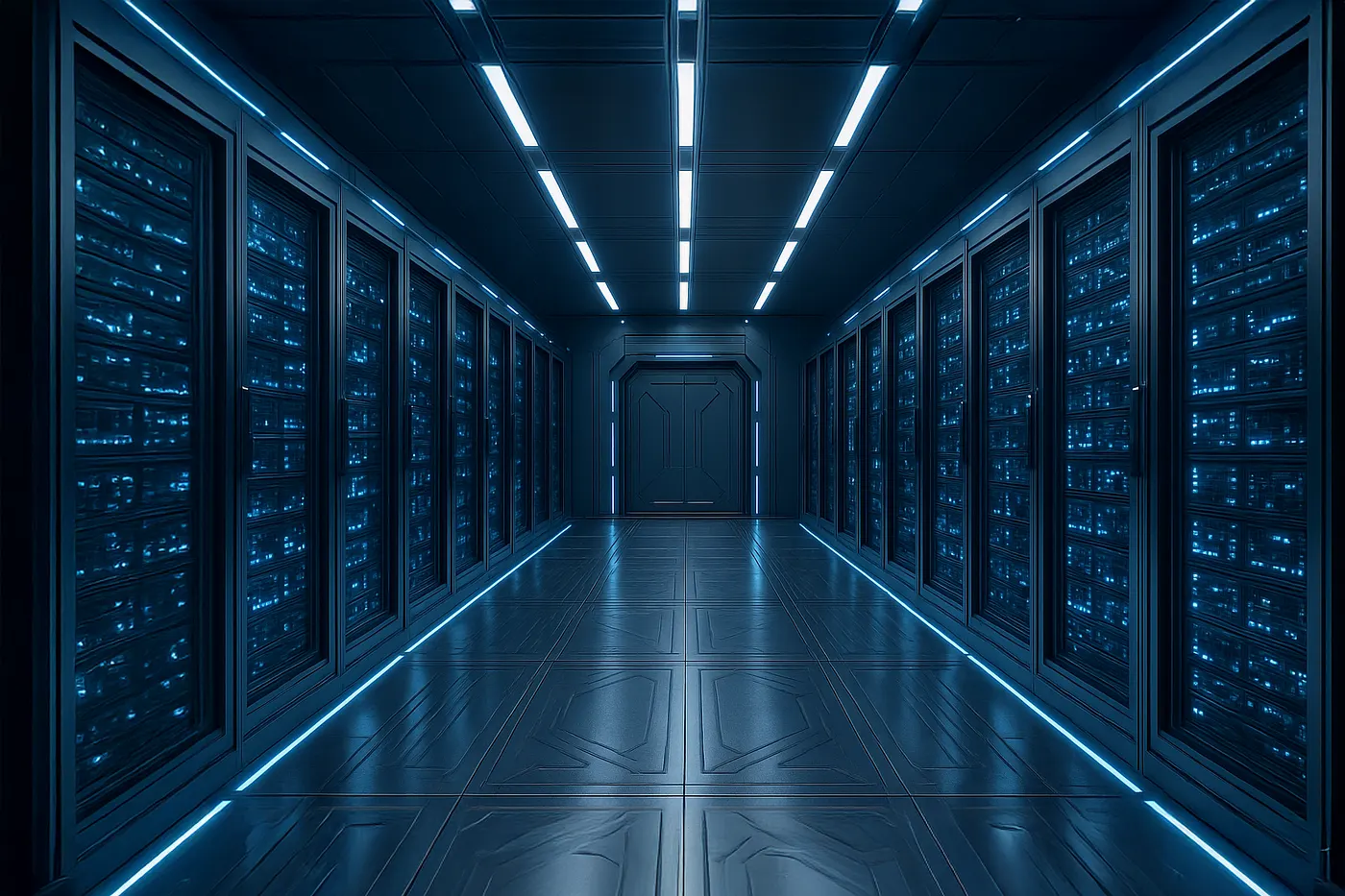
This is where your product and service design brain kicks in. The real failure is not the screen you tap. It is everything behind it.
The system looks something like this
• Front layer where users vote
• Middle layer that handles logins and real time vote processing
• Back layer that pushes results to the team running the show
• Support layer that communicates issues to viewers
If any part fails the whole thing falls apart. The user does not see the engine room but they absolutely feel every mistake it makes.
For a show that sells the idea that the public decides the outcome the trust in the voting system is part of the brand promise.
Where things could have been better:
• Load testing for millions of simultaneous voters
• Clear feedback when the system is busy
• Backup voting options like web or text
• Honest messaging when problems appear
The takeaway is simple. Designing for scale is designing for trust. If you ignore scale you lose trust.
You Might Think It Is Only Chaos in the Jungle
Yes the jungle is meant to be messy. Screaming. Worms. Dodgy meals. But app chaos is not entertaining. It is annoying.
If a prime time programme cannot deliver a reliable voting flow when the whole country is watching it makes you wonder how many digital products are bluffing their way through launch day.
Here is the reminder, reliability is a design choice. You build it long before the moment the user taps the button.

How I Would Redesign the Voting Experience
Let us be honest. The current app feels like it was built to survive a quiet Tuesday afternoon, not a national event where everyone piles in at once. If you were designing this from scratch you would treat it like a giant digital funnel with one goal. Let people vote fast and confidently.
Here is how that looks.
A smoother entry point
No long forms. No unnecessary steps. You open the app and you are in. The vote button should be impossible to miss.
A realistic traffic system
If the system is busy, tell people. A simple queue screen with a countdown is better than silent failure.
Clear confirmation
You need a moment that tells the user their vote landed. A tick. A sound. A small animation. Something that makes the action feel real.
A backup plan
This is where the show needs to learn from proper product teams. If the app is down, the vote should switch to a web page or a quick text code. Losing the whole vote because of the app is not an option.
Transparent communication
When things go wrong the team should say it straight. People forgive problems. They do not forgive silence.
Takeaway. The best voting experience feels almost boring. No drama. No surprises. Just a clean line from intent to action.

Why Viewers Behave The Way They Do
People treat live voting like a small piece of power. You do not get many moments in your daily life where your one tap actually influences something on television.
That is why the emotional reaction is so strong when it fails.
You get
• Ownership
• Participation
• A shared national moment
Remove the vote and you remove all three.
There is also the group psychology. People want to vote because other people are voting. It is the digital version of peer pressure but in a fun way.
What designers forget is that voting is not just a feature. It is a social ritual. Break the ritual and the whole atmosphere shifts.
Takeaway. When you design for mass behaviour you design for emotion first and features second.
What Product Designers Should Learn From This
This moment on I am a Celebrity is a perfect lesson for anyone working in product, service or interaction design. The failures were obvious. The lessons are even clearer.
Here are the ones that matter.
Predict demand before it crushes you
You know when the vote window opens.
You know how many people will try to vote.
There is no excuse for being surprised by traffic.
Friction kills trust
Every time the app reloads or stalls you lose a fraction of the audience.
Trust is not lost instantly. It is lost in tiny drops.
Experience is bigger than interface
You can have the best looking screens in the world.
If the system behind them collapses the experience is broken.
People remember the moment, not the layout
Nobody goes on Reddit to analyse the typography.
They go to say “I could not vote and the result felt rigged.”
Your job is not designing pretty screens. Your job is making sure people never say that line about your product.

A Final Thought Before We Leave the Jungle
The show will recover. It always does. People love chaos in the jungle. But chaos in the voting app is not entertaining. It is avoidable. And that is what makes it valuable.
If you design digital products take this moment seriously. Do not wait until the big launch to discover the cracks. Do not assume your system can carry the load. Do not hope your users will stay patient. They will not.
Build reliability into the foundation. Protect the emotional contract. Make the critical moments boring in the best possible way.
If you found this useful and want more of my work in product, UX and design, you can find everything in one place here: Ryan Thomas
Follow me to keep in touch
Where I share my creative journey, design experiments, and industry thoughts.


